
By Dustin Hawes
Love it or hate it, the NBA Cup is here to stay. As someone who leans toward the annual early-season tournament being more gimmicky than essential, there is one element of the spectacle that I love and appreciate: the limited-edition courts. They are bright, bold, and in-your-face. But fans only get a visual taste of these courts a handful of times per season. There is something to be said about the NBA placing more design emphasis on making the NBA Cup feel as grand as possible compared to lazily slapping a digital NBA Finals trophy logo on the court, only after being pressured by fans … but that is another discussion for another day. Below is a ranking of the top 10 NBA Cup court designs for the upcoming season.
All photo courtesy of NBA.com
#10. New Orleans Pelicans

You will notice a theme on this ranking: darker colors. With courts so colorful and bright, the darker tones are much easier on the eyes. Two elements of design I really love with this court are the menacing and massive pelican etched into the blue background of the court as I feel like it’s eyes are staring directly at me, and the color of the NBA Cup trophy works perfectly with New Orleans’ tri-color palette.
#9. Indiana Pacers

Simple, yet impactful. Utilizing the bold, bright yellow as the baseline border allows for the dark blue court to pop. NBA Cup games played in their home white uniforms will look incredible on this court. Bonus points for the “Boom Baby!” wordmark on the bottom baseline. I love how Indiana incorporated their traditional “P” logo with the ball motioning through the double o in Boom.
#8. Boston Celtics

What can I say, I love the parquet! Is there a more iconic in all the league than Celtic green? Only three courts (Boston, Milwaukee, Minnesota) feature green as the primary floor color which lends to the uniqueness of this particular design. This court would have been higher on my list had the border been flipped to white instead of black; I’m still not sold on a franchise as historic as Boston leaning into the trend of black alternate uniforms. Games would have looked incredible on that court with the C’s donning their home whites.
#7. Milwaukee Bucks

Like New Orleans, Milwaukee’s court gets a boost from the pop of the gold NBA Cup trophy elements added to the across all aspects of the court. The dark forest green is going to be easy on the eyes. This design likely would have been higher if they opted for a cream-colored border instead of the black. I’ve never been a fan of the Bucks’ jerseys when they tried the black alternates. Thankfully, they limited the blue to a single stripe on one baseline.
#6. New York Knicks

Now we’re starting to cook a little bit. The obvious eye-catching element is the New York skyline that is etched in the blue base at the bottom of the court; the only team to incorporate their skyline into the design, which makes sense considering it’s one of the most recognizable cities in the entire world. A smart touch to put Madison Square Garden in orange, matching the “New York” wordmark across the middle of the court.
#5. Orlando Magic

It feels wrong having this court only ranked at number five. The new, modern-retro rebrand is on full display with this design, mimicking their new Statement edition jersey. Bonus points for being the only team to utilize multiple colors for their baseline. Hopefully they rock the aforementioned Statement jerseys in NBA Cup play, because those will absolutely pop against the grey background.
#4. Utah Jazz

These final four courts were nearly impossible to rank for me. It’s wonderful seeing Utah revert back to their past and lean into the purple. The mountains in the background are dominant but not overpowering visually. I also love how all of the court have a pixelated look to them; I’m not sure how that will play out in live action, but digitally, it looks great. The purple is going to stand out as Utah is the only team to use purple as their base design color. However, the Jazz lose points for going with black, on the logo and the baseline, instead of the full 90’s revival palette of light blue, white, and clay.
#3. Philadelphia 76ers

I know everyone is clamoring for the late 90’s, Iverson-era Sixers return. I get it; it’s a great look. But no one has nailed a recent rebrand better than the 76ers, who have one of the best jersey rotations in the league and usually have a top-tier city edition jersey. The baseline red and blue court compliment each other like peanut butter and jelly. Putting the memorable “Phila” center court was a great decision and the stars surrounding the cup looks aesthetically pleasing to say the least.
#2. Portland Trail Blazers

When you have the most unique logo in the National Basketball Association, you use it and you lean into it. For fans in arena or watching on television, seeing the pinwheel and having it look the same from any vantage point is something no other team can accomplish. The brightness of the red provides just enough color to make up for the cement grey. Also, and I’m not sure if this is intentional or not, but the dashing lines on the court design look like drops of driving rain to me. Big design win.
#1. Atlanta Hawks
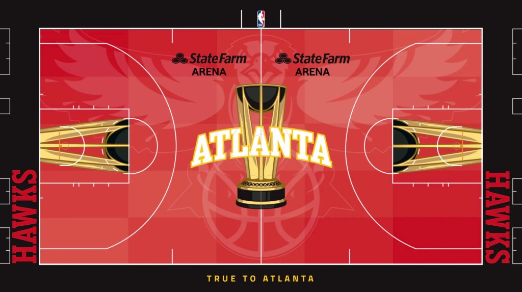
It’s all about the Hawk. Atlanta goes back to their mid-90’s cartoonish Hawks logo and places it front and center. Not only is that logo beloved but it looks intimidating as all hell paired with the red-colored floor. There are just enough hints of yellow that don’t bring this design over the top and the black baseline was the perfect choice to balance this design. Bonus points if they decide to wear the Mutombo throwbacks during the NBA Cup.
