By Dustin Hawes
As a fan of the league for over 30 years, I have a love and appreciation for the aesthetics of the game. From jerseys to court designs, I’m infatuated with seeing how each team puts together the finished product. And with the 2020-21 NBA season quickly approaching, many teams are releasing additional designs. Below is a ranking of the top 10 court designs for the upcoming season.
#10. San Antonio Spurs City Edition Court

The 90’s are alive and well in the Alamo City as the Spurs finally embraced one of the greatest color schemes in professional sports. Whether it was on merchandise or team-issued warm-ups, San Antonio teased us all in the 90’s with their “Fiesta” colors.
Given how well those three colors compliment one another, the final court product is a little underwhelming. But baby steps, right? The fact they branched out from the silver and black is good enough to crack this list.
#9. Philadelphia 76ers City Edition Court

The Sixers strike again. From the font to jerseys to the court, few teams can match the branding and attention to detail of the Philadelphia 76ers.
Red and blue can be a tricky color combination to utilize, but Philadelphia balances it well and the addition of black to the City palette just pops.
#8. Chicago Bulls Primary Court

Although not as intimidating as the all-red design of the former Chicago Stadium, Chicago’s current design pays homage to their old stomping grounds as they incorporated the team’s easily recognizable font under each baseline.
While the excessive amount of logos on the court is, well excessive, it’s still timeless and one of the most iconic logos ever created.
Bonus points for the Bulls removing that hideous basketball from mid-court.
#7. Dallas Mavericks 40th Anniversary Court
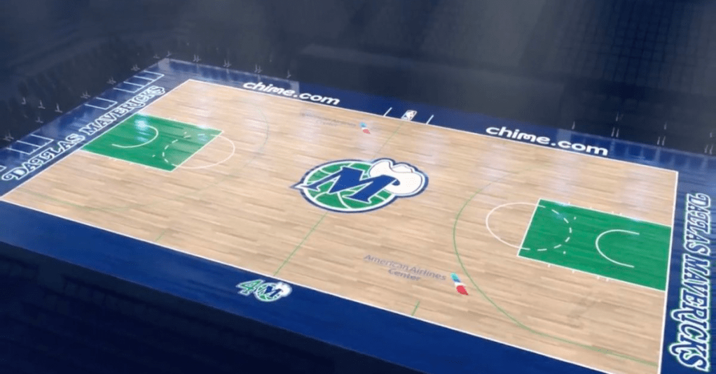
The only downside about this design is its one-year shelf life. Dallas is celebrating their 40th anniversary this upcoming season and turned back the clock for this beaut. There’s something about a vibrant green and royal blue that is just so aesthetically pleasing. While we’re at it, let’s get the Seahawks and Timberwolves to turn back the clock as well!
Dallas’ western font returns and it looks gorgeous streaking across the baseline under both baskets. Their retro “M” logo, albeit slightly cheesy, is such an upgrade over their current robotic horse that’s been used since 2000.
#6. Golden State Warriors Primary Court

Golden State is one of only two NBA teams utilizing yellow and blue as their primary colors, the other being the Indiana Pacers. I love how the Warriors leaned into the all-yellow design. Not only does the color pop on the television screen, but it’s intimidating as hell.
The all-yellow paint and sidelines creates a distinct look, unmatched by many in the league, and allows for their logo to stand out amongst all the color.
#5. Memphis Grizzlies 25th Anniversary Court
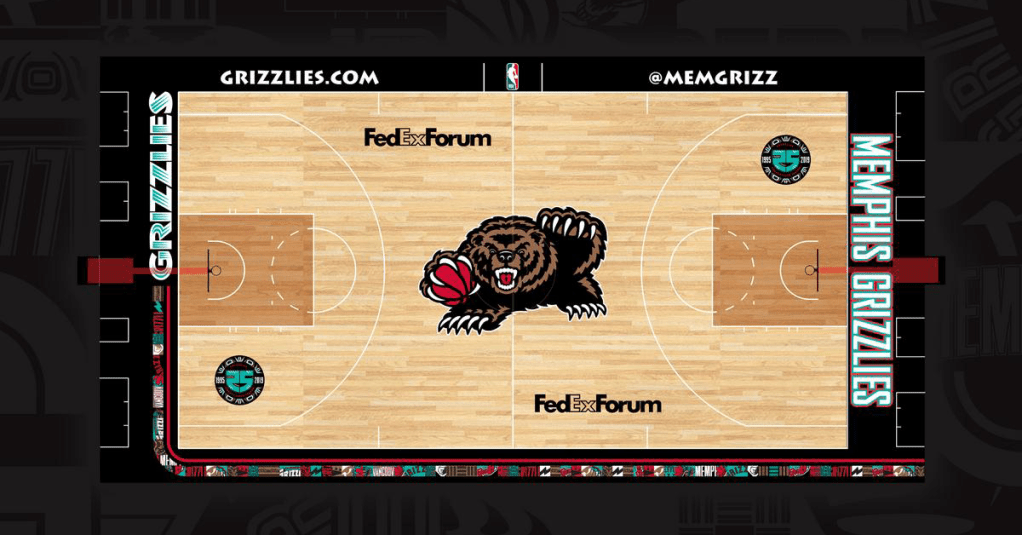
Can the Grizzlies return to this logo full-time, please? The oversized grizzly is the star of the show and sets the stage for the remaining elements to fall into place. The stained hardwood in the paint is a nice surprise and the sideline art caught my eye without being overly disruptive.
My only complaint is the lack of teal and red. While I definitely dig this design, I would have liked to seen a more loud design, especially with that grizzly front and center.
#4. Miami Heat City Edition Court

There’s a lot going on here. Vice Versa is Miami’s latest and final installment of their beloved Vice City collection, so enjoy it this season. To be honest, I have no idea how this court will look on television as it definitely turned up the volume a few notches from the previous Vice City court.
Regardless, the color scheme is already an all-time classic, up there with the likes of the Charlotte in the 90’s and San Antonio’s Fiesta trio. The script Miami is perfection.
Bonus points for the lack of a corporate sponsor on the court, which would have only added to the noise.
#3. Los Angeles Lakers Primary Court
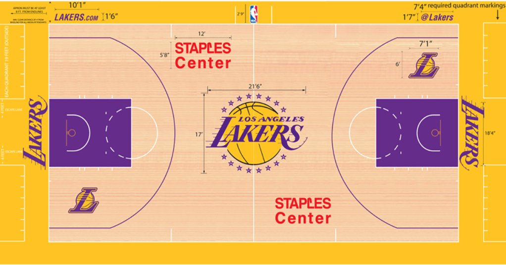
I loathe the Lakers so it pains me a bit to put the Lakers up this high, but this court is superb. Los Angeles has one of the best logos in sports with an instantly recognizable script font that is prominent throughout the court design.
Purple and gold is synonymous with the Lakers and, as the only NBA team utilizing the color scheme, it will stay that way for the foreseeable future. Also, it’s such a flex to put 17 stars, each detailed with the year they won the championship, surrounding the logo.
#2. Boston Celtics Primary Court
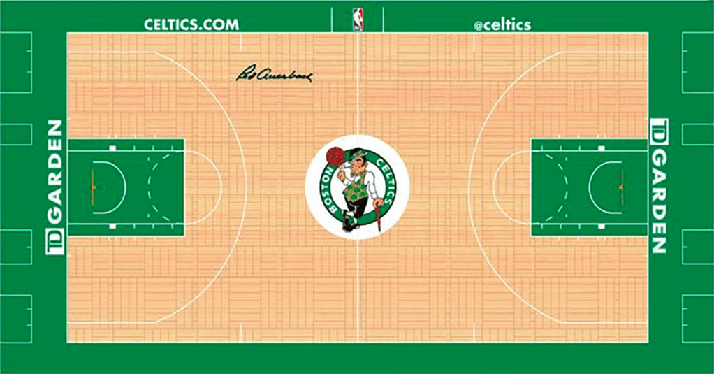
I am a sucker for parquet courts and this simplistic design has stood the test of time for decades. Celtic green is about as iconic as it gets and it stands out perfectly against the hardwood.
Bonus points for the Celtics putting their corporate sponsor underneath the basket, allowing for more open space on the beautiful parquet.
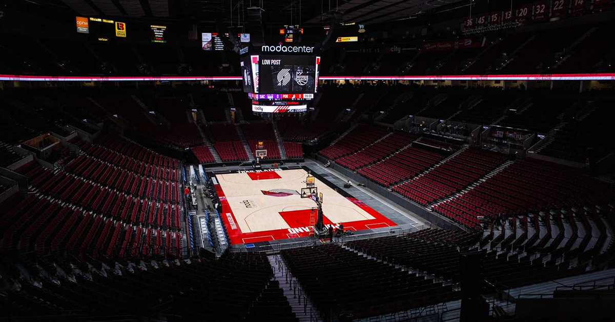
#1. Portland Trail Blazers Primary Court
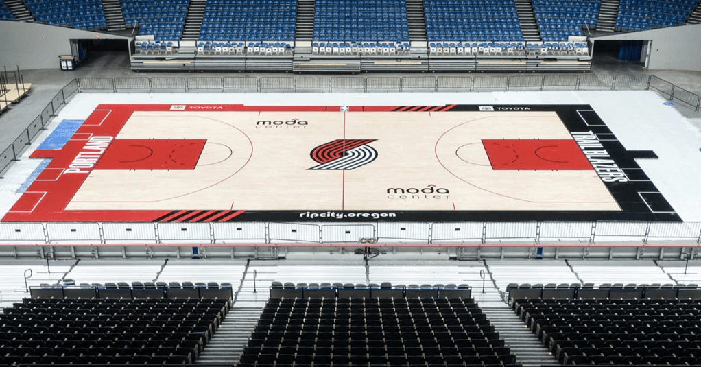
Am I bias? Absolutely. However, I really do love this updated court design. To me, the pinwheel is the best logo in sports and I love how no matter what side of the Rose Garden you sit on, the pinwheel always looks right-side up.
Last year’s 50th anniversary design was incredible as it incorporated the white key from the 90’s, but it was made clear from the jump it was a one-and-done.
New to the design this year is the two-tone sideline coloring which incorporates both red and black, giving the court an even more distinct Blazer feel. Rip City, Oregon on the sideline is a wonderful nod to our rallying cry.
No court will ever top the early 90’s perfection, but this year’s version is top notch across the league.
Cover photo via Bruce Ely/Trail Blazers
